CSS 포지셔닝은 박스 모델을 배치하는 것을 의미합니다. CSS에서는 float을 이용해 정렬을 할 수 있습니다. float은 사전적 의미로 '떠오르다', '떠다니다'입니다. 웹 페이지에서는 float을 왼쪽이나 오른쪽에 배치할 때 사용하며 배치를 하지 않을 경우 'none'으로 표현합니다.
1. float 쓰는 법
선택자{ float: left; /* 문서의 왼쪽으로 배치 */ float: right; /* 문서의 오른쪽으로 배치 */ float: none; /* 배치하지 않음 */ }
예문을 하나 작성해보겠습니다.
<!DOCTYPEhtml>
<htmllang="ko">
<head>
<metacharset="utf-8">
<title>float 사진+글</title>
<style>
div{
width: 600px; height:700px;
border: 5pxsolid#000;
margin: 50pxauto;
}
img{
width: 300px; /*크기 하나만 작성 시 다른 하나 자동으로 비율 유지*/
float:right;
padding:10px;
}
</style>
</head>
<body>
<div>
<imgsrc="people.jpg">
<p>Lorem ipsum dolor sit amet consectetur, adipisicing elit. Id odit ipsum earum adipisci. Sint voluptatem quaerat tenetur eum id, autem laboriosam distinctio qui perferendis inventore. Ullam consequuntur quam consequatur eaque? Lorem ipsum dolor sit amet consectetur adipisicing elit. Ipsa voluptatibus obcaecati quos itaque asperiores suscipit corrupti officiis, deserunt soluta excepturi facilis eveniet hic, aspernatur autem cum eius porro esse a. Lorem ipsum dolor sit amet, consectetur adipisicing elit. Incidunt, earum veritatis. Maiores, molestiae dolore impedit corrupti libero ea exercitationem ab inventore quae ipsam, quod minus magni eveniet dolorem qui possimus?</p>
</div>
</body>
</html>
이렇게 float은 글과 그림을 함께 배치할 때 사용되곤 합니다.
float을 이용하여 구조를 잡아봅시다.
<!DOCTYPEhtml>
<htmllang="ko">
<head>
<metacharset="utf-8">
<title>float2</title>
<style>
.box{
width:600px; height:300px;
border:2pxsolid#000;
}
.boxdiv:first-child{
width:300px; height:100px;
background:pink;
float:left;
}
.boxdiv:nth-child(2){
width:300px; height:100px;
background:lightskyblue;
float:left;
}
.boxdiv:last-child{
width:600px; height:100px;
background:lightgreen;
float:left;
}
</style>
</head>
<body>
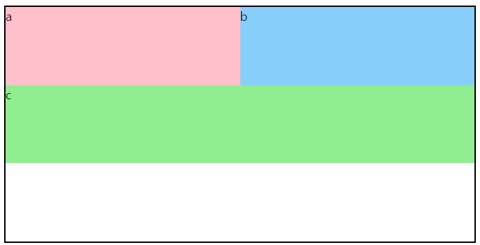
<divclass="box">
<div>a</div>
<div>b</div>
<div>c</div>
</div>
</body>
</html>
600*300의 부모 박스 안에 300*100, 300*100, 그리고 하단에 600*100의 박스를 배치해보았습니다.
2. clear 속성
float 속성으로 박스를 배치하면 이어지는 다른 요소들도 동일한 속성이 적용됩니다. 이때 더 이상 float 속성이 필요하지 않다면 기존 속성을 해제하기 위해 clear 속성을 사용합니다. 실제 박스의 정렬 작업 시 원하지 않은 박스가 위로 올라오는 경우가 있을 수 있습니다. 이럴 때 clear: both;를 이용하면 원하는 대로 박스의 정렬을 완성할 수 있습니다.
clear 사용법
선택자{ clear: none; /* clear 속성을 설정하지 않은 것과 같음 */ clear: right; /* 오른쪽으로 붙는 float 정렬을 취소 */ clear: left; /* 왼쪽으로 붙는 float 정렬을 취소 */ clear: both; /* 왼쪽, 오른쪽 모두 붙는 float 정렬을 취소 */ }
예문을 통해 clear 사용법을 알아보겠습니다.
<!DOCTYPEhtml>
<htmllang="ko">
<head>
<metacharset="utf-8">
<title>float3</title>
<style>
div:first-child{
width:300px; height:100px;
background: pink;
float:left;
}
div:nth-child(2){
width:300px; height:100px;
background: lightskyblue;
float:left;
}
div:last-of-type{
width:300px; height:100px;
background: lightgreen;
clear:both;
}
</style>
</head>
<!--
clear: 취소하다 (float값 무시)
left float:left 해제
right float:right 해제
none 해제 X (기본값)
both float:left, float:right 해제
-->
<body>
<div>a</div>
<div>b</div>
<div>c</div>
</body>
</html>
만약 c에 clear: both;속성을 주지 않는다면 그대로 나열이 될 것입니다. 하지만 c에는 clear 속성을 주었기 때문에 하단으로 다시 내려간 것을 볼 수 있습니다.
3. float 사용 주의사항
float 속성을 사용할 때 position: absolute를 사용하면 안 됩니다. float 속성은 상대적인 위치이기 때문에 요소의 위치를 고정시키는 position: absolute 속성이 적용되지 않기 때문입니다.
또한 float 속성을 사용하면 해당 요소는 일반적인 흐름에서 벗어나 부모 요소는 해당 요소의 높이를 인식하지 못하게 됩니다. 이 경우 부모 요소에 overflow: hidden 속성을 추가하여 해결할 수 있습니다.
예전에는 float 속성으로 레이아웃을 구성하는 것이 일반적이었지만, float 속성은 요소들이 떠다니면서 (일반적인 문서의 흐름에서 벗어나서) 다른 요소와 겹치기도 하고 높이를 인식 및 계산하지 못하는 등의 문제점이 있어 flexbox나 CSS Grid와 같은 레이아웃 기술을 활용하면 더 효율적인 구성이 가능합니다. 따라서 float 속성을 이용한 레이아웃은 참고 정도로 보는 게 좋습니다.
레이아웃을 float을 이용하여 구성해보겠습니다. 1단, 2단, 3단 레이아웃을 만들었습니다.


